As we know from previous SEO posts, Googles algorithm takes a lot of things into account when it comes to ranking a site. They look at keywords, Pagerank, Domain Authority, social media sharing, backlinks and several other areas in order to display the most relevant and recommended results on their search page.
They announced a new change coming into effect on April 21st 2015. They will now also look at how your site is displayed on mobile devices when deciding how highly you will rank in search results.
This means that websites and blog that are optimized for all devices will rank higher on searches made on mobile devices than sites that aren’t.
A quick look on Google Analytics will show you that more and more people are viewing your website and blog on a mobile device so it’s really important to ensure your site is optimized for viewing on all devices. This was an obvious move for Google moving forward.

How do I know if my site is mobile friendly?
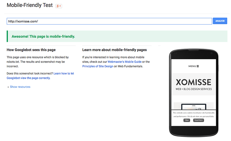
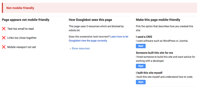
The quickest and easiest way is using this free Mobile Friendly testing tool by Google. Just enter your URL and it will show you the results as well as a screenshot of how your site appears on a mobile device.
Open Google on your mobile device and search for your website or blog. If your site is mobile friendly there will now be a gray “mobile-friendly” notice underneath each URL in the description snippet. To see all the indexed pages of your site then search for site:yourdomain.com instead and check if all pages on your website / blog are mobile friendly.
Check the site yourself on a mobile and tablet device, testing the different features and pages. My advise is to write down a list of anything that isn’t working correctly or looking right so then it’s easier to go through the list and correct it.
Check the Mobile Usability section of Google Webmaster Tools. It will tell you a list of things that can be improved on your site to help optimise it for smaller devices. Even if your site passed the mobile friendly test, there may still be errors and it’s best to fix them.

Oh no!! It’s not mobile friendly! What do I do?
You have a couple of options depending on the platform you are using and how much you have to invest in a design that is mobile friendly. Remember that the quality of code has a part to play in how well you rank so look for an experienced developer.
- Look for a custom or pre-made theme / template that is either responsive, has a mobile template included or offers a mobile version of the template.
- Hire a developer to recode sections of your site for it to be mobile friendly.
- If you are on Blogger, you can activate Bloggers Mobile Template by going to Template > clicking on the cog / gear icon under Mobile > select the option to show the mobile template on mobile devices > select the template you want to display > save. It’s pretty basic but it is a good temporary option if you can’t invest in a mobile friendly template right now.
- If you are using WordPress, the Jetpack Plugin have a mobile template option that you can activate or you can install WP Touch that will make your site mobile friendly. Good options if you don’t fancy switching themes, hiring someone or know how to alter your theme to make it mobile friendly.
- If you’re using one of my pre-made templates and want to activate the mobile version of the template go to Template > click on the cog / gear icon under Mobile > select the option to show the mobile template on mobile devices > select Custom > save.
The SEO Starter Checklist
50+ easy steps to rank on Google, increase website traffic and boost your visibility as a new business

How I can help you get a mobile friendly site
- I’ve updated the custom design packages to include options for custom responsive design and custom mobile versions of your custom template. Our blog packages now come with extra SEO benefits to help your blog reach a larger audience. See blog packages here and website packages here.
- We also have some Blogger Templates in the shop that come with matching mobile template and a brand new responsive customisable template too – it’s on sale until April 21st! Shop pre-made Templates here.
- If Bloggers Mobile Template is too basic for you but you want to keep your current blog design, we can create a custom mobile version of your existing template. It will match your current design and can include some of the gadgets that are on your blog. See the details and pricing of that here under “Other Coding Extras”.

16 responses to “How to make sure your site is mobile friendly to avoid dropping in search results”
Thanks so much for this post, it really helped! Also, how could I make a search bar code? I have an image that I would like to use as the search bar, I am just not sure how I would make a search bar out of the image.
You could use it as a background image, but you would have to adjust it to fit correctly. I don’t have a post on search bars sepecifically, but you can use the code and CSS from this tutorial whereveer you want the search bar.
Thank you for this post. You are always on top of your stuff. Hope you are doing well!
Ah thank you 🙂 hope you are doing well too!
Another super helpful post! Thanks for sharing your knowledge with us. The mobile friendly checker is super helpful!
Thanks for this suggestion! Do you have any tips/information about your sites (mainly blogger) viewed in mobiles (mainly iPhone & iPad)? My header image shows up nicely, but the blog content is displaying on the left and not centered. (http://fishingforeducation.blogspot.com) (This is something I’d like to learn more about but I’m finding no luck on Google. I believe it has something to do with viewport.)
Hello Stephanie, I plan to do some more posts on Blogger mobile + Blogger responsive templates as it’s now very important. For Blogger mobile verion template you can use one of their mobile templates or code a custom template on Blogger. If you aren’t familair with how to do so but do want to code your own there’s some CSS specific to the mobile view in your template already that you can adjust. For repsonsive Blogger templates you use media queries in the CSS to adjust the layout depending on the screensize used. The viewport tag tells the browser the scale width of your site, it’s already part of the Blogger template so you don’t have to worry about it 🙂
Hi. I kinda have the same problem. Whenever I use my iPad to view my blog, my header and blog post body are not in the center. I can’t figure out what’s wrong. Do you have any suggestion of what I should do to make it all in the center? Thank you so much! 🙂
Hello Giselle. I’ve just taken a look at your blog on a mobile and iPad. You don’t have a responsive template or the mobile version of your template enabled, you’ll need to do one of these to make your design mobile friendly. That’s the only way you’ll be able to have the content centred on these devices.
very useful information it’s very informative post
Regards
JENNIFER
Appreciate your level of detail and excellent tips for SEO. Will share with my contacts.
Thanks for this post! And all your posts- you make CSS and HTML actually seem approachable. I used your post on the 5 common coding mistakes to go through my template and search for errors, so thank you for that as well.
I have one question, while my blog is mobile friendly (and I am happy with how it appears on mobile devices) when I click on a post title on the main page, it links to the post, but only the date header and post title appear. The post bodies do not display. (And the mobile homepage displays only summaries so basically the content is not visible). I can’t seem to find where the error is. Thanks in advance for any advice you may have!
Hey Shayda, thank you so much! Ooh how did you manage that? haha Okay, the problem is that there’s some code missing, do you have a backup of the template that you can restore? If not, you’ll have to manually re-add it. I’d recommend downloading your template before attempting it.
Set up a second blog, you’ll only need it temporarily so you can delete it afterwards. Go to Template > Edit HTML > Jump to Widget > Blog1 and you’ll see a line with the ID of
mobile-post. Expand it by clicking on the arrow on the left and copy that entire section from<b:includableto</b:includable>. Now go to your blog, find that section and paste the code in the same place. This should now include the code for the content area. I hope that makes sense. I offer a custom coding service if you would prefer to hire me to do it for you, as this kind of tweaking can be a little scary.Hey! Thanks for replying so quickly. I realized that if I don’t have the mobile template set to custom, then things are fine. I’ve set mobile to ‘default’ now, so the mobile site is working, but it doesn’t look the way I want it to. Maybe I’ll try setting it back to ‘custom’ and adding the html. Thanks!
Okay, I’m on Blogger and I do have the mobile version enabled but my problem is that if I send someone a link of my blog from my mobile and they are on desktop, they still see the mobile version which doesn’t adapt very well to desktop in this case. How do I make my themes more fluid and responsive do that it automatically detects and adjusts without removing the m1 thing from the mobile link manually?
Here’s my blog: http://www.jasminecatchesbutterflies.com
Please take a look. Haven’t been able to find any answers for this online.
Turn off mobile version and change to a responsive theme (easiest way is to use Media Queries) which will adapt to any screen size (example here – adjust your browser screen).