We’re back with another HTML for Beginners post, this time on the Box Model. Margin and Padding are used so often for spacing out elements in a design.
I mention the two a lot in tutorials and regularly get asked how to edit spacing on different design elements in comments and emails.
Today’s post will explain the differences between padding values and margin values as well as a couple other CSS tips. This isn’t anything complicated, but knowing it will help you understand areas of your blog design and hopefully make adjusting your layout a little easier.
The box model
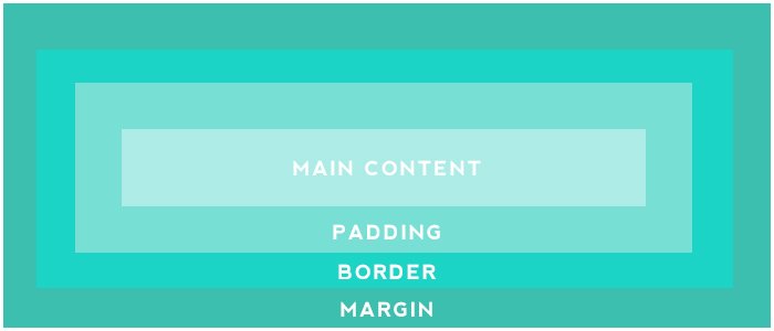
The Box Model is a collective name for margin, border and padding. In the centre you have the main content or element. This could be an image, a button, some text or something else.
We then have the padding around that, then the border area and finally the margin area on the outside. These values can contribute to the height and width of an element.

It’s important to remember that the margin is space outside an element while padding is the space inside an element.
What does that mean? Adding padding values will add space around the element, if it has other style attributes such as a background or border they will be affected by the padding. Adding margin values will add space outside of the element, so it will be sepearate from content around it such as other text.

There’s so many examples of how to use these both. We could add padding and a background to text to create a button and add a margin to separate that button from other content around it like text or images.
We can use one value to set an equal space on all four sides. We can also set the value individually for each side using margin-top, margin-right, margin-bottom, margin-left, padding-top, padding-right, padding-bottom and padding-left. We can shorten the values too as the next section will show you.
Using CSS shorthand for box model
We can shorten values down and combine them in CSS. Notice that this works in a clockwise direction (top, right, bottom and left). So if we used the following declarations
margin-top: 5px;
margin-right: 10px;
margin-bottom: 15px;
margin-left: 20px;
we could replace that with this instead
margin: 5px 10px 15px 20px;If the top and bottom values were the same and the left and right values were the same like this
margin-top: 5px;
margin-right: 10px;
margin-bottom: 5px;
margin-left: 10px;
we could use this instead
margin: 5px 10px;If the value is the same for all areas like
margin-top: 5px;
margin-right: 5px;
margin-bottom: 5px;
margin-left: 5px;
we simply use one value
margin: 5px;The values we use affect the layout in different ways, as you can see with the image below. The same HTML is used but the CSS we’ve added creates two different looks. The grey area is the padding, it’s adding space around the element on the inside. The dashed line is the margin, it’s adding space on the outside and is the area where other content will not enter.

I hope you found this post helpful in editing existing CSS or adding your own values. Once you start editing these it becomes easier to understand and you’ll pick up different ways to use them. Let me know if you have any questions.

4 responses to “What you need to know about the box model (editing margin, padding and border values)”
This is an excellent post, and very informative. Thank You
This post is very informative, I learned a lot. I’ll definitely be using it as a reference.
One question though. Do you have any idea how I can get my Instagram snap widget to display full width in my footer? I’ve already made both the header and the footer full width by following one of your previous tutorials and I’ve also played around with the margin and the padding using this tutorial, and nothing.
There’s still an unsightly gap between the top of the gadget and on both sides of it. I am completely stumped. I’ve even made my entire blog responsive to different platforms and still nothing.
Any help on the matter would be greatly appreciated.
-Janeese
hey there! I love this because it’s helped me a lot with fixing up my blog. BUT how do I get all my buttons to be the same length? I guess I’m just a little confused as to what to put in my coding >.<
You can set a width if you want the buttons to be the same, however this may cause some of the longer text to run off or below the button.