This post will show you how to easily add a simple and responsive image gallery to your Blogger/Blogspot blog.
Galleries are a great way to display multiple images without making the user scroll through a long slow-loading page. This tutorial will show you how to add an image gallery in a grid layout with rows and columns.
You could use an image gallery to add a portfolio, project gallery, recipe gallery or a visual archive page that links to separate posts on your blog. You could also add a gallery within separate posts to showcase a collection of images such as travel photography, external products, shop this post or lookbook items.
How to add a simple and responsive image gallery to Blogger
On Blogger, go to Theme > Edit HTML and find the CSS section of your theme (between <b:skin> and ]]> </b:skin>). You’re going to add the CSS above the closing ]]> </b:skin> tag.
Related: How to find and edit code in your Blogger theme
Style your image gallery with CSS
Paste the following right above ]]> </b:skin>
/* START SIMPLE RESPONSIVE GALLERY XOMISSE */
.gallery {
    padding: 0 5px;
    float: left;
    width: 24.99999%;
}

div.gallery img {
    width: 100%;
    height: auto;
}

div.gallery img:hover {
	opacity: 0.8;
}

div.desc {
    padding: 10px;
    text-align: center;
}

* {
    box-sizing: border-box;
}

@media only screen and (max-width: 700px){
    .gallery {
        width: 49.99999%;
        margin: 6px 0;
    }
}

@media only screen and (max-width: 500px){
    .gallery {
        width: 100%;
    }
}

.image-gallery:after {
    content: "";
    display: table;
    clear: both;
}
/* END SIMPLE RESPONSIVE GALLERY XOMISSE */
This styles the images and captions in a grid format, as well as making it responsive (go from 4 columns to 2 columns to 1 column depending on screen size). Customise this CSS as you wish.
Want a 3 column grid instead? Change the width value on .gallery to 33.333% instead.
Build your image gallery with HTML
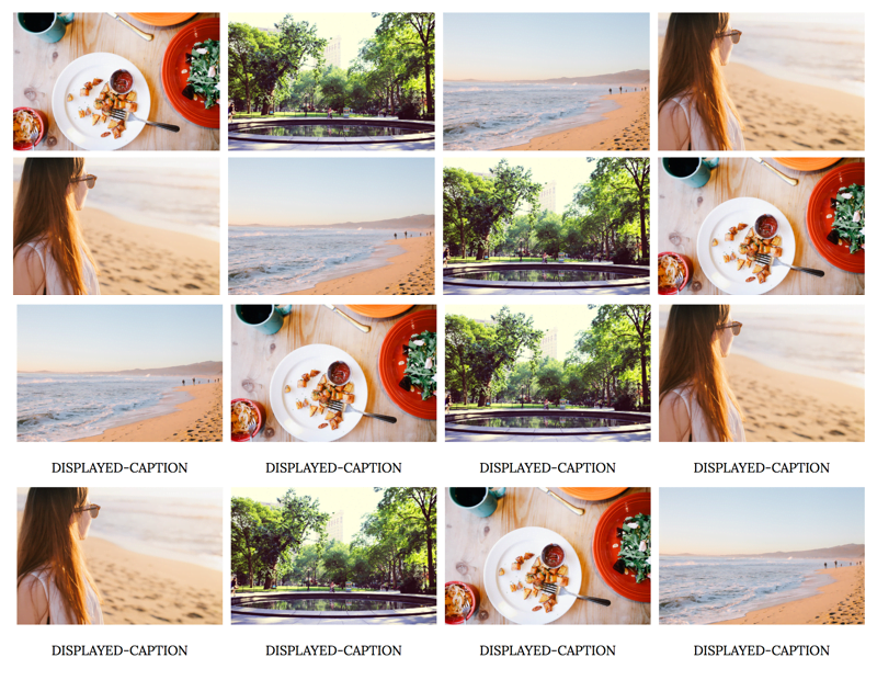
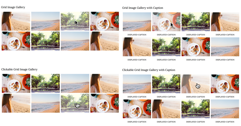
There are four style options depending on if you want a standard image gallery with/without captions or a clickable gallery, with/without captions, that links to other posts, pages or external sites.
To add the gallery to a post, page or gadget, copy and paste the following HTML. It’s important that you make sure you’re pasting it in HTML mode (not compose/rich text mode) and don’t switch between modes once you paste it, otherwise Blogger will add code between the lines and break the structure.
<div class="image-gallery">

  <!-- Grid Image Gallery -->
  <div class="gallery">
      <img src="IMAGE-URL" alt="SEO-IMAGE-CAPTION">
  </div>

  <!-- Grid Image Gallery with Caption -->
  <div class="gallery">
      <img src="IMAGE-URL" alt="SEO-IMAGE-CAPTION">
      <div class="desc">DISPLAYED-CAPTION</div>
  </div>

  <!-- Clickable Grid Image Gallery -->
  <div class="gallery">
    <a href="LINK" target="_blank">
      <img src="IMAGE-URL" alt="SEO-IMAGE-CAPTION">
    </a>
  </div>

  <!-- Clickable Grid Image Gallery with Caption -->
  <div class="gallery">
    <a href="LINK" target="_blank">
      <img src="IMAGE-URL" alt="SEO-IMAGE-CAPTION">
    </a>
    <div class="desc">DISPLAYED-CAPTION</div>
  </div>

</div>
Now upload your images and replace IMAGE-URL with the direct image URL.
Related: How to host images directly on Blogger
Replace LINK with the post, page or external site you want that image to link to. Replace SEO-IMAGE-CAPTION and DISPLAYED-CAPTION with an SEO friendly descriptive caption.
Related: How to SEO your posts on Blogger
To add more images, simply copy and paste the block of Grid Image code within the image-gallery div wrapper.
You can now save and publish your post or page. Your image gallery should be displayed in a nice grid and be responsive when you change the browser screen size.
35 responses to “How to add a simple and responsive image gallery to Blogger (4 different styles)”
This is just what I was looking for to design my own AdBlock resistant chumbox ads. Thanks a million!
Wow how interesting. I just have a few questions regrading this tutorial. Will this grid update automatically? Would you be able to use this tutorial to create a grid based page for your blog, one that displays all your blog posts in grid as opposed to a list?
Hello! No, it won’t update automatically, it’s meant for showcasing specific images in a gallery. Yes you could use the styling in the post above and instructions from some other posts on mine (like this and this) to show your blog posts in a grid 🙂
Hey there. I just installed this code on my blog, but some of the formatting is a little wonky. It’s uneven along the top and some of the photos bump down a line by themselves. This is the page I’m talking about: http://www.thecraftpatchblog.com/p/youralttexthere.html I’d sure appreciate some help understanding what’s happening. THank you for the great code!
Hi Jennifer. It’s looking fine to me right now, have you since fixed this issue?
Hi, I found that mine was doing this too. It was fine on posting, but if I go back to edit the page, Blogger has kindly added in a load of breaks in between the code.
If you just delete off those extra breaks, it goes back to normal and seems to stay that way…. so its Blogger (surprise surprise) not the code/tutorial.
I love this, thanks so much for sharing 😀 xx
Hi Jen. Yes, you need to paste in HTML mode and avoid switching between modes. Otherwise Blogger will add paragraphs and break spaces. Glad to hear that, thank you! Would love to see it if you want to pass on a link 🙂
I’m pretty sure you have an option to have breaks only inserted on an enter command in post options or possibly in the blog settings.
Thanks so much for this! I’ve added it to my page, but it will only display the first two rows even though I added a bunch more in my post. See here: http://www.ohtobeamuse.com/2009/01/lookbook.html
How do I get the other images to show up?
Hello, the source code is only showing code for four images within the page so double check the contents to make sure there’s no errors that’s blocking the rest of the code.
hi! i was trying to add overflow:hidden; to the gallary so is square, but doesn’t work? i mean, just transform the image, doesn’t crop it. do you know if there is a way to fix it?
Hi Elaine, thanks for the tutorial. I have added this to my blog, and it looks great except that it places the 5th image on its own row, and the rest are how they are supposed to be. I have tried with different scaling parameters (25%, vs 33.33%, vs 20%) and 33.33% is the only one that doesn’t seem to do that. There is nothing in the blog post html that suggests theres a break or something different for that one photo. I have deleted and recreated the gallery multiple times. Here’s the post preview (its not published yet). Any suggestions?
Hi Jessica. I can’t view a post preview, it will need to be published and live on your site for me to view it.
Sorry! It’s published now! Having the width set at 33% seems to be working the best. With any other arrangement, there is a line break that occurs after the first row. I will set it to 25% so you can see.
https://midnightwink.blogspot.ca/2018/03/february-lip-of-day.html
Hi Jessica, 24.9999% seems to work best – example here. Remember to account for the 5px padding on either side of each image.
Hi
If I changed float: left; to float: center; it will become a vertical line of images
how can I fix this ? I need the images to be in the middle of the post not left or right
Thanks in advance
Hello, “center” is an invalid property for float. The images must be floated left to appear in a grid. You need to centre the parent div so use
.image-galleryand the instructions in this post to center.Hello,
Thank you very much for this post, it was very useful. However, I´d like to open the url of the images in the same browser window, instead of a new popup window. Can you please tell me how?
Thank you!
Salvador
Hello, remove
target="_blank"from the a tag 🙂Ciao, vorrei inserire questa gallery in una pagina di blogger, ma mi compare la sidebar a destra. Anche se nascondo la sidebar, la gallery risulta sempre al suo posto, quindi non centrata.
Domanda: è possibile nascondere la sidebar e posizionare al centro la gallery? In che modo? Grazie.
Hi Ro, you can remove the sidebar on that page using conditional tags (shown here). By your sidebar you can make the content space full width.
thanks 🙂
Hi, my images are not going side by side how do I that? Thanks
Check your CSS for any errors. If you leave your blog link I can take a look 🙂
Sorry, I just have a couple of more question. I’m trying to put this on a separate page on blog but it is not going across it is going straight down. How can I fix it?
My other question are; Is it possible to have an hover effect with a caption (and maybe a like option) instead of the caption being under the picture?
And finally, is it possible to add page numbers to the bottom page?
Thank you and sorry if this is too much.
Hi Esma, check your CSS for errors. You can customise the CSS to change the location of the caption and change the HTML to have it multi-paged 🙂
Thank you! This is just what I’ve been looking for. Is there a way to make the links “no follow” for any that are affiliate links?
Best way is to manually do it, instructions here 🙂
Thank you!
Thanks, this is really helpful!
ITs good but how to scroll it when i added more image
Hi,
This looks nice, I’ve been searching for something like this for a while.
Can you tell me how add a “image swap” function on mouse-over?
I like to swap an image with a text (or jpg of a text) but I’m not that much of a programmer.
Anyway, Thank you for your work.
Duco de Klonia
the Netherlands
Hi Duco, there’s an example of how to do hover images here. Hope that helps!
your the best guys, i really really need this to add on my beloved blog. thanks for awesome article
how about the mobile version?