Many blogs these days consist of two or more topics, your home feed can be a mix of several different things. To make it easier for readers to find what they are looking for, it’s important to have a navigation system.
Todays post will show you how to create a basic navigation bar to separate blog topics using the default styling from Blogger tabs and customising it. You can also use this to edit the look of tabs using the pages gadget.
Other navigation posts:
- Adding navigation to top of blog
- Making navigation stay/stick/fixed to top when scrolling
- Create a horizontal navigation menu using images
- Create a drop down navigation menu
- Remove borders from page tabs
Create a basic navigation bar
1. First thing you need to do is organise your blog labels/categories/tags. Split your blog into categories and sub-categories, create a label for each. When you write a new post, apply the correct label. Use the URL of each label as your link URL below.
Not sure how to do this? Here is a post on using Bloggers post labels as categories.
2. In the Layout tab, paste the following code in a new HTML/Javascript gadget and enter your own links & titles. I prefer doing this over using the pages or label gadgets, as it gives me more options.
<!-- START XOMISSE NAVIGATION -->
<div id="navigationbar">
<ul id='cssnav'>
<li><a title="home" href="LINK">Home</a></li>
<li><a title="TITLE" href="LINK">PAGE TITLE</a></li>
<li><a title="TITLE" href="LINK">PAGE TITLE</a></li>
<li><a title="TITLE" href="LINK">TOPIC</a></li>
<li><a title="TITLE" href="LINK">TOPIC</a></li>
</ul>
</div>
<!-- START XOMISSE NAVIGATION -->
Edit Navigation bar and page tabs
3. Go to Template > Customise > Advanced and edit the “Tabs” elements. This can change the borders, background and colour.
4. Now go to Template > Edit HTML. Within the CSS part (<b:skin> ... </b:skin>) you’ll see a tabs section which, depending on your template, may look something like this. If you’re comfortable with CSS and Blogger, you can fully customise your tabs here. If not, the next step will show you how and what to edit.
/* Tabs
----------------------------------------------- */
.tabs-inner .section:first-child {
border-top: 1px solid #eeeeee;
}
.tabs-inner .section:first-child ul {
margin-top: -1px;
border-top: 1px solid #eeeeee;
border-left: 0 solid #eeeeee;
border-right: 0 solid #eeeeee;
}
.tabs-inner .widget ul {
background: #666666 url(//www.blogblog.com/1kt/simple/gradients_light.png) repeat-x scroll 0 -800px;
_background-image: none;
border-bottom: 1px solid #eeeeee;
margin-top: 0;
margin-left: -30px;
margin-right: -30px;
}
.tabs-inner .widget li a {
display: inline-block;
padding: .6em 1em;
font: normal normal 14px Arvo;
color: #666666;
border-left: 1px solid #ffffff;
border-right: 1px solid #eeeeee;
}
.tabs-inner .widget li:first-child a {
border-left: none;
}
.tabs-inner .widget li.selected a, .tabs-inner .widget li a:hover {
color: #999999;
background-color: #ffffff;
text-decoration: none;
}
5. If you aren’t comfortable with editing the above code yourself, here are the main areas that people like to change. Go to Template > Edit HTML and add the code before </b:skin>
/* Remove Spacing & Border of First Link in Navigation */
.tabs-inner .section:first-child ul {
margin-top: 0px;
border: 0 solid #eeeeee;
}

/* Background & Border of Navigation */
.tabs-inner .widget ul {
background: #999999;
border: 0px solid #eeeeee;
text-align: center  !important;
}

/* Font, Colour & Border of Links */
.tabs-inner .widget li a {
font: normal normal 14px Arvo;
color: #333333;
border: 0px solid #ffffff;
}

/* Font & Colour of Rollover Links */
.tabs-inner .widget li.selected a, .tabs-inner .widget li a:hover {
color: #eeeeee;
background-color: #ffffff;
text-decoration: none;
}

/* Centre Navigation */
.tabs .widget li, .tabs .widget li{
display: inline;
float: none;}
Remove Borders
Check out this post on how to remove borders from page tabs.
Showing in a bulleted list…
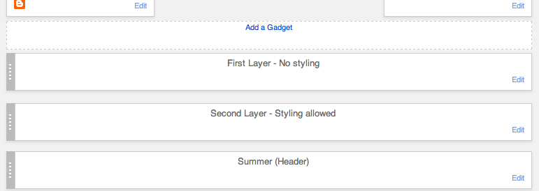
Because this tutorial is using the default styling for Blogger tabs/pages, it needs to be the right area of the template to pick up the CSS. In the layout tab drag your header, navigation and any other gadgets down a little. It will jump to the second level, this shouldn’t affect the look of your blog but it will add the default styling that can then be customised. This image will hopefully explain that better.
That doesn’t mean we can’t make it stick while scrolling or appear above the header or other elements. The tutorials below will show you how to do those things.
140 responses to “Create a basic navigation menu and edit page tabs on Blogger”
Thanks, but this didn’t seem to work for me. Probably because I already have a linkbar.. wanted one beneath header too.
You should be able to add multiple ones using the method above, but if you edit the CSS it will alter the one above the header as well. You could also try this tutorial for adding a drop down menu but not add any sub-categories.
Is there a way to adjust the width of this bar? My blog is 960px wide with my header to the left of the content area. My content area is 642px wide and I would love for the bar to be the same width and centered over the content area.
Thanks for your help! I LOVE your tutorials. They have been a great help to me. 🙂
I don’t understand what i supposed to do with both codes. I Suppose,i change the tabs codes for the main areas codes that you provide us. i appreciate your answer
Hello, in the last section I show the main areas to change for a basic navigation just to change the background and border. Other changes can be made in the Template Designer. Check out these posts for updated, more in depth tutorials about altering your navigation/tabs section in Blogger.
I changed everything as you say, but don’t see it the navigation in centre.
http://mirandatesting.blogspot.com/
Hello Miranda. You navigation bar isn’t in the tabs section of your HTML on your testing site which is why it isn’t adopting your tabs CSS. Go into Layout and move the HTML gadget down one layer, then it should be in the right place. If you are trying to centre the navigation on your main site find
#mbwnav li, changefloat:left;tofloat: none;and adddisplay: inline-block;between the brackets.Ellie, i’m still without understand, why i don’t see it. I’m so confused.
http://mirandatesting.blogspot.com/
We haven’t added anything yet which is why it’s not centred, but now your navigation is in the tabs section so code can be applied to it. Go to Template > Edit HTML and find
]]> </b:skin>. Above]]> </b:skin>add/* Centre Navigation */ .tabs .widget li, .tabs .widget li{ display: inline-block !important; float: none !important;}then find.tabs-inner .widget ulin your HTML and addtext-align: center;between the brackets.when i use to add code above the ]]> & then after saving templates the codes which i added shows above the Header..at blog.. ???
Make sure you’re adding it above
]]></b:skin>and not<b:skin>. The CSS section on your blog is<b:skin><![CDATA[/* ... ]]></b:skin>so adding it above the opening tag (<b:skin>) will make it appear on your blog.Which brackets do you mean exactly? It doesn’t work on my blog and i can’t find where i have to put them.
Between the curly brackets of
.tabs-inner .widget ulHi there! I’ve been trying fiddle around with the navigation bar on the Edit HTML part, but ever since Blogger changed that whole section, I can’t figure anything out or even find the Tabs section! Do you know how to edit the nav bar using the new interface?
http://lxstboys.blogspot.com/
Hello, here’s a post about finding code in the HTML editor in Blogger with further information at the end of the post explaining the new interface. Also, check out these posts for updated versions of editing the navigation bar.
All of your tutorials have been brilliant – struggling on a couple of bits… Is there anyway to get the tabs centred on the page? I can’t seem to get it!
Also, I’ve read your tutorial on how to incorporate pictures into the navigation bar – is there a way I can do it for the code from this tutorial?
Thanks,
Lucy
Hello, thank you so much. To centre the tabs just add
text-align: center;to#navigationbar. Yes of course, just replace the text with image tag so for example –<a href="LINK"> TEXT </a>change to<a href="LINK"> <img src="DIRECT IMG URL" width="WIDTH" height="HEIGHT" alt"DESCRIPTIVE WORD"/></a>.Sorry, not sure I’m being too clear on the first point! What I mean is I don’t want the navigation bar to stretch right across my page. I want it to sit central above my content (set to 1050 pixels on blogspot).
Havent got round to putting the pictures in yet but thanks for that tip!
x
Using this tutorial it will automatically default to your Templates code. Adding the code above will place it in the centre of your blog, to set it to a certain width add
width:1050px;🙂Hey! The code worked great for me, but I’d like some more space between the page titles. How can I achieve this? 🙂
Hello, between the navigation and your post titles or between the links in the navigation? To add more space between the links in your navigation, find
.tabs-inner .widget li ain Template > Edit HTML, above</b:skin>and addpadding: 0px 20px;in between the brackets. Alter20until you get the space you want.Love this tutorial! I just have one question, how do you get the navigation to fill the entire width of the screen (like on your website) rather than doing a set width?
Thanks!
Really depends on your template, whats your URL and I’ll take a look?
I just did this tutorial! My nav bar looks great! Thanks so much.
Quick question though. I’m trying to link the “photography” tab to an outside site. Is this possible? Right now it’s trying to redirect to a page inside of my blog.
Thanks for your help!
Yes of course, you need to use the full URL including http:// otherwise it thinks you’re opening a page within your blog.
I’m trying my hand at design with a test blog (not the one I listed). Since I’m new, I’m having a hard time understand what the first step “First thing you need to do is organise your blog labels/categories/tags. Split your blog into categories and sub-categories, create a label for each. When you write a new post, apply the correct label. Use the URL of each label as your link URL below.” means. Can you break it down for a newbie designer? Thank you!
When you write a new post, you can apply a label/tag to it in order to categorise your posts. So just use your labels to add categories to your navigation menu. On blogger, the URL of your label will be http://BLOGURL.blogspot.com/search/label/LABELNAME so if you wrote a review, you may label it reviews and then add a “reviews” category in your navigation using the URL – http://BLOGURL.blogspot.com/search/label/reviews
Hey Ellie! Back again. 😉 I’m trying to figure out how to get my text center alligned on my navigation bar, and I’ve added the code that you advised some others to do, but it’s not doing it. I may have added it to the wrong spot. Thanks again!
http://www.octoberjune.com
Hello, have a few steps to take so I’m going to list them as best I can.
1. Find
<b:skin>and remove it from above there, that’s in the wrong place and is actually showing up under your navigation bar on your blog as an error.2.Find
</b:skin>and right about it remove the multiple copies of code for navigation – think there’s about 3 versions of it so remove the code from afterpost-body img, .post-body .tr-caption-container, .Profile img, .Image img, .BlogList .item-thumbnail img { ... box-shadow: 0px 0px 0px transparent !important; }up to/* Centre Navigation */.3. You’re then left with the code for centring navigation and the navigation css itself. Under
/* ----- NAVMENU Styling ----- */replace#NavMenu { ... } #NavMenuleft { ... } #nav { ... }with#NavMenu { width: 100%; height: 40px; position: fixed; top: 0px; left: 0px; margin: 0 auto; padding: 0; border: 0px solid black; z-index: 999; } #NavMenuleft { width: 100%; margin: 0 auto; padding: 0px; display: inline-block; } #nav { margin: 0 auto; padding: 0; border: 0px solid black; text-align: center; }That should solve it! Let me know how you get on x
Currently offline from the public my website.
I am trying to create a top menu navigation with drop down fixed and sticky bar.
I have achieved the menu navigation with drop down, using one of your tutorials, but I cant manage to move it to the top (above the tittle) and let it fixed while I scroll.
I want to create something like this one (http://mexiquer.blogspot.pt/).
PLEASE, can you help me?
Hello Francisca, I have a tutorial for that also. It’s the first part of this tutorial – Create a Sticky Navigation when Scrolling
Ellie I can’t manage to place the tab on the top of my website. The code doesn’t work.
I don’t want to put the website online, but I will autorize your gmail account for visiting ok? Please help me placing the black menu on the top of my website.
THANK YOU SO MUCH
Hello! If you want to place the navigation at the top of your blog have a look at these tutorials – moving gadgets above header and sticking navigation to top of blog.
Hi great tutorial just one question I have created a label beauty on one of my posts there will be many posts with the label beauty where do I get the URL to paste into my naivgation bar thanks 🙂
Richael
x
Hello! Just click on “beauty” label in the post, the link that shows will be the URL you need. It will look like http://BLOGNAME.com/search/label/beauty
Hello. I’ve been trying to center my navbar under my header but haven’t been able to do so. Do you have any suggestions? 🙂
http://makeupwithahart.blogspot.com/
Hello! Find
#cssmenuin Template > Edit HTML and addmargin: 0 auto;between the brackets.Hi, I just saw your reply. Thanks for getting back to me so quickly. I’m a bit unsure where to add that code to? Which brackets do you mean?
And now I’m having another trouble. I’ve emailed CSS Menu since I’m using one of their premade menus but they haven’t gotten back to me yet. I changed my menu around and now when I try to replace the old CSS with the new CSS, the menu doesn’t work! The new HTML seems to be working though. What am I doing wrong?
Hello Cindy, I’m sorry I don’t really understand what you mean. If you’re using a custom menu, the selector names (div id’s, etc) for the CSS associated with it are probably different than Bloggers default. If you’re adding a new navigation menu, the CSS selectors you use (as it the element you’re adding the CSS to) may need be different.
Hello, go into Template > Edit HTML > find
]]> </b:skin>and above it you’ll see#cssmenu { .... }. Addmargin: 0 auto;before the closing bracket of#cssmenu { .... }.Thank you so much! It worked for me. Definitely going to be checking out your blog more often for more tips 🙂
Hi Ellie! First, great tutorial! I’ve been reading through tons of your tutorials and have bookmarked most (if not all :-P) to work through before I launch my blog.
I’m having some issues centering the nav bar. I’ve read through this post and the “how to create a drop down navigation menu on blogger” post and none of the ‘centering’ fixes are working for me. Am I missing something? Thanks in advance!
Hello Amelia, thank you very much. Change
width: 990px;towidth: 100%;under#NavMenuand then add.tabs-inner { padding: 0px; } .section {margin: 0px;}to your CSS above]]> </b:skin>in Template > Edit HTML.Works perfectly. Thank you so much!
Hey I think I got it to work I just don’t know how to post stuff under a certain category lets say I want to post about makeup I want to post it under makeup section.
When writing a post you can add labels to it so “makeup” for example. You then use the link to that label within your navigation bar.
Hello Ellie, love the tutorial. I am a bit confused on where I should be creating my links. I have the navigation bar installed but there are no links that my readers can click on? Also, why is it so thin, is that something you can change when customizing it?
Hello Abbey, the links can be pages, labels or external. If using pages you go to Blogger > Pages > View Page to get the exact link. Yes of course, you can add a height value to the menu.
Hey Ellie,
Sorry to bother you but I’m really struggling with this. I replaced my code with your code (for the tabs design) but my navigation doesn’t look anything like a navigation, just a bullet point list of links? How do I make the links line up on one line, if that makes sense, and remove the bullet point? Also, sorry for all the questions, how do I make my navigation go above my header? I’m usually pretty good with HTML but I have no idea for this.
Thank you xx
Hello, your navigation is in the sidebar which is why it’s not picking up your templates CSS so it thinks it’s a list and not a navigation bar. You need to go to Layout and move the gadget beneath your header above your blog posts and sidebar. Here is a tutorial for adding gadgets above the header.
Oh thank you so much Ellie! I didn’t realise it was that simple, sorry to waste you time. But thank you again, you’re such a star xx
My navigation bar is acting like a sticky navigation bar but it is in bullet form. What do I do?
Hello Cathy, you need to move the navigation down one level. I explain how at the end of this tutorial.
Hi Ellie. How do I add a search box and social media icons to my navigation bar. By the way this tutorial worked great for me. Fiddling with a test blog at the mo, before I use the template on my actual blog.
Hello Jenny. I have a tutorial for adding a search bar here and social media icons here.
This didn’t seem to work for me, the links just all appeared on my blog jumbled up and didn’t go into a drop down menu
What’s your URL? Make sure you’re also adding the CSS in the tutorials for drop down menus either here or here. This is what makes them a drop down style.
Thanks for such a nice navigation menu….i was really in need of it.
For some reason I can’t find anything in my html for me to edit the tabs. Is it the type of template I’m using? If so, what type do you suggest? I’m using “simple” right now. No where in my css is the *tabs thing.
Hello Sara, what’s your URL?
I checked your template and it’s definitely there. Go to Template > Edit HTML and you’ll see
<b:skin> ... </b:skin>, click the arrow on the left in the numbering beside this to expand it and there you’ll see the code. Usually around line 350 or so.Ah Thank you! So I figured everything else out, but now I still can’t figure out how to center it! I can’t find the #cssmenu anywhere!
Are you using a test blog as I can’t see this on your current one? There’s no code for
#cssmenuin this tutorial, the lady in the comments above was using a different tutorial of mine. The code to centre this menu is the last few lines in the last box in the tutorial 🙂Yeah I’m using a private blog so that I can work on my layout whenever I have time and just post it when it’s done! ^.^ And that worked, thank you so much!!!!
Another great tutorial that have benefited me. Thanks!
how can i change color of background of my nav. menu ?? i want to change to black http://prntscr.com/3octs5
See “Background & Border of Navigation” in Step 5
This is a great tutorial, thank you so much. Is it possible to reference more than one label in a single navigation item?
Ex: I have posts labelled ‘travel’ and posts labelled ‘Explore’ which I would like both to appear when you click on the navbar item for ‘Travel’. Is that possible? To add two urls to the same nav menu option?
Thanks!
Hello, no unfortunately it is not possible. They have to have a common label.
Hi, your tutorials blog were amazing. Love it!
In my HTML, i could not find the ‘Tabs section’ to edit it to my desired sizes and colours. Hope to hear from you soon. Thanks for your help! 🙂
You can customise it via the Template Designer (Template > Customise > Advanced) or by adding the code from step 5 to before
</b:skin>. If you’re comfortable with CSS you can totally customise the tabs using the tabs section in Template > Edit HTML, the tabs section is usually around line 250 in between the header and headings section.Hi!
I have figured out how to make a navigation bar, but how do I make sure all tabs are evenly spaced out?
Also, how would I add subchoices after you click the main “heading”
Ex. under reviews I’d want ‘makeup’ ‘hair’ face’ ‘body’ as the suboptions…thanks!
You then need a drop down menu, not a basic one. I have a tutorial for that here.
Thanks so much for this post… due to this I was able to make a menu bar at top horisontally. However, now I need the drop down from the top… that is when I click on reviews – i get a drop down there of theater show… while right now with the code I am getting on the side…. help in this would be appreciated a lot. Thanks so much.
You’ll need to code a drop down menu, here is a tutorial for that.
Dear Ellie, this is great, thank you! I’ve gone through most questions as I don’t want to be redundant, The blog link is just a test one, and I’m working from a bought template. I have a HOME bar that is PAGE gadget, and I made one following your tutorial, Java, but I want to separate my post and not have them all show up on the HOME page, how can I do that?
Also how would I integrate the design within my template? I tried separating the titles to no avail.
Thanks so much!!!
Hello Brenda, I’m not sure what you mean? Could you explain further? All posts by default show on the homepage for the Blogger platform.
Hi! I am able to add the code navbar code, but adding the extra code in the Tabs section that you have pre-customised for us does not change anything and doesn’t make it horizontal etc. Do you know what I’m doing wrong? Thankyou!
Hello, theres no styling in this tutorial apart from the few fixes I gave which are frequently asked how-to’s. This is a basic navigation taking styling from the tabs code already in Blogger, compared to this tutorial which is fully custom. Your navigation isn’t appearing correctly because it’s “in the wrong place” according to Blogger and therefore can’t pick up the correct code. Check out the end of this tutorial for a fix. Hope that helps!
How do I make my tabs so that when I click them, it takes me to the desired place, especially for the tab saying ‘home’? Also, how do I get my posts to appear in the right spot? For example a post about codes to appear under the codes tab. Whenever I click on them it says ‘the page you are looking for on this blog does not exist’. Thanks 🙂
Hello Emma, this post should help – http://xomisse.com/blog/how-to-properly-use-labels-as-categories-on-blogger/
Hi!
Thank you so much for this post. It has helped so much. I am trying to make my tabs aligned to the right instead of the center (kind of like, for example, if you were in a word document and you clicked “Align Right” and everything shifted to the right). How can I align the tabs to be right aligned, if that makes sense? Thank you so much 🙂 xx
http://saraashly.blogspot.co.nz
Hello Sara, add the following to your CSS
.tabs .widget li, .tabs .widget li {float: none; display: inline-block; text-align: right;}It will be better if you could post the screenshot of the output what we get when it the code is executed in the blog.
Hello, thank you for your feedback. There is no before and after for this tutorial, as the final result depends how you edit the CSS. I don’t show a specific look or screenshot as it’s showing the standard Bloger navigation which differs depending on the template you are using the the values you’ve selected in Template Designer.
Hey Ellie! I have been really enjoying coding thanks to your blog, but I have hit a wall with this nav bar I am working on. I cant get everything side-by-side no matter where I look, and I dont want them in a list format. Can you review my code and let me know what I need to change? Thank you SOOO much!
http://www.jasoncollinsphotoblog.blogspot.com/
Hello Jordan, go to Layout and click edit on the HTML that has your navigation. Remove the line break
<br>in between the list items. The line breaks make sure each item is on a separate line.Thank you so much! Looks great! You are a saint, and thank you for all that you do, I love that xomisse is my first stop for any coding needs and troubleshooting!
xo!
Thank you Jordan, so happy to hear that! 🙂
Hi, how can I add my blog name to the navigation bar just like you have?
You can add it as a graphic / image or as text. I’ve just added it as text within the navigation and repositioned it 🙂
Hi Elaine, I’m not quite sure how to do that. I mean I know how to add the text but how can I customise only my titles font and not the other category titles.
Hello. You can add something like
class="title"to the list item, then you can use the selector.titleto style only it 🙂I get this error whenever I put the code on number 5. It says that “&” is wrong. It is colored red. please help me 🙁
Hello. You shouldn’t be getting an error for putting
&in the css section so double check that you are adding it above]]></b:skin>and not above<b:skin>. You can always remove the&from the CSS I’ve provided.Hi.
Is there anyway to get rid of the slash in between the entities? Your tutorials are great, btw. Thank you.
Hello, thank you 🙂 do you mean the borders around it? If so, here is a tutorial for that.
The good thing about this navigation menu is, It is fast loading and designed in such a way that it will surely increase conversion optimization of my blog. I will be glad to use it for my blog. Thanks for sharing this ultimate piece.
Hi Ellie! I am so glad I found your blog. Your posts are so helpful! I followed this tutorial using html widget vs pages. I was wondering if you had a solution for bloggers mobile template since it appears it used the pages widget for top navigation?
THANKS!!
Hey Kelsi, awh thank you so much! I don’t have a tutorial on it as it is more complicated and hard to write something that will apply to everyone, but you can code your own navigation in a similar way to the above to show on mobile using the custom mobile template. I might do a tutorial on it in the future.
Hi, thank you so much for this post! I have been trying to follow step by step and edit the CSS but think I’ve probably made a mess of things! I’ve got mostly there, but when I hover over a tab the sub-pages listed below are positioned too far to the right instead of lined up directly below. I would really appreciate any help with this, if you have time!
Thank you! 🙂
Hello! Align the text of the sub items to the left and reduce the padding values for
#nav liand#tabs li🙂Hey!
Thank you for this post! I’ve just begun designing a new blog layout, and I have a couple of questions please. I’ve followed this nav bar tutorial, as well as a couple of your others, but I can’t seem to figure out how to add more of a space inbetween page links (e.g home, about, contact, advertising) and on the top and bottom of bar. Could you please tell me how to do that?
I did figure out how to add the space on the top and bottom, but when I hovered over one of the page links it would only change the hovering colour of original link size, rather than both the original link section and the extras I have added ontop – I guess that I wasn’t doing something right there! Hopefully that all makes sense haha.
The link for the relevant piece of coding is: http://pastebin.com/gCAjjnfr
Thank you! 🙂
Hi Millie. You can add
padding: 20px;to.tabs-inner .widget li ato increase the space between each link and on the top and bottom in order to allow for the hover colour to work also. Hope this helped!Hi
I have 2 questions. I will be so grateful if you can help me.
1) I used the method no 2 that you mentioned (since method 1 isn’t working for me for some reason) however my images seem to be really huge. How can I reduce them in size slightly?
2) When I view the website from a mobile device that code doesn’t seem to work and all the images appear in different sizes (as opposed to a desktop where they code seems to be working)
Hello. You’re better off resizing the images to be the correct size before uploading, and you’ll need to code a responsive navigation as image navigation aren’t very mobile friendly 🙂
Hi! I’m not quite sure about how to execute the step about the bulleted list. The code for my nag bar just appears at the top of my page.
The CSS is in the wrong place, that’s why it’s appearing at the top of your blog. Make sure you’re putting it above
]]> </b:skin>and not above<b:skin>.Hello! Just want to say a massive thank you for this post! I’ve been trying to work out how to the the top nav bar for my blog for a while now since I changed the layout and have had no luck so far but finally have been able to do it in a way which isn’t confusing!! So thank you sososososososo much! Now to just do the final touches and then so social media buttons and I’m all done with the template of my blog! Thank you again!! Em xx
Hey Emma! Awh thank you so much for the lovely comment, your navigation looks great!! Hope you’ve had a great weekend 🙂
Finally finished all the navigation bar fun stuff done! And did learn some new tricks along the way!! Really cannot thank you enough! Em xx
Hi Elane! I actually have two questions:
1. How do you create those separated boxes for each gadget?
2. There are white spaces between each tab category, how to I get rid of it?
Please reply! Love your blog btw
Hello, thank you! The post here will show you how to remove the borders from the navigation. To have a background for each sidebar gadget, add a background value and padding to
.sidebar .widget.thanks Elaine!
Hi. I’ve been trying to apply those codes on my blog but nothing happens. I also cannot apply anything else like nivo slider and yeah, sticky navigation bars. I hope you can help me with it. Btw, I’m using the simple template from blogger.
Hi Lei, do you currently have this installed on your blog? I can’t see the codes in your template to see what might be causing you an error. This and the tutorial for sticky or fixed navigations have both been tested using Bloggers Simple Template so they should work.
I removed it first since I nothing shows up. I’ll add the codes again and I hope you can help me fix my problem 🙂
Let me know when you’ve added it and I will take a look 🙂
Hello. I already put the codes for the basic navigation bar and for the fixed bar codes. If you take a look at it, it’s just a series of texts with links. 🙂 Thank you.
You’re missing a
}above.backtotopand have an extra}above]]> </b:skin>. These errors in your CSS means that the rest of the CSS is not being read correctly by the browser. As you don’t have some of the original Blogger CSS for tabs in your CSS you’ll need to manually make some further edits yourself, like the following.tabs-inner .widget ul {height: 30px; line-height: 30px;} .tabs-inner .widget li a {padding: 10px;}to correct spacing.It finally worked for me! Thank you so so much!!!! Thank you for entertaining my questions and everything 🙂
No problem 🙂
Thanks a lot helped me so much
Hey, thanks so much for all the posts. I’ve found them super useful. One thing I’m currently struggling with, Ive created my navigation bar and I’ve created an about page in pages, however when I click on the about button on my blog, it says the page doesnt exist. Ive put the ‘link’ as what the URL would be. Im just so confused. What am I doing wrong? Thanks in advance 🙂 xx
Hello 🙂 awh so glad! If you go to the Pages tab and click view on your about page, you’ll be able to get the correct link to use.
Thank you, very helpful!
Thank you, this really helped me, I have been trying so many different things! This was really easy and straight forward 🙂
missjosiana.com
Thank You So Much, It’s Really help me to make a good looking nav-menu. 🙂
Hi! I’ve followed your instructions and I’m pretty close to getting the effect I want. All I need to know now is:
* How can I center the menu while keeping it full width? Mine right now is at full width, but the menu is on the left side of my screen.
* How can I add vertical dividers between the tabs? I would only like them in between the tabs, but not before the first tab or after the last one.
Thanks!
Hello Sandra, using
#cssnav {text-align: center;}should centre the items. Add your border and use:first-childor:last-childto remove from the first/last tab, in a similar way to how it’s shown in the first piece of CSS in step 5.Thanks in advance
But when I add code above the ]]> it can’t work, and its shows only page link please help
Make sure there are no other errors in your CSS, the browser won’t be able to read the styling correctly if there are errors. If you’ve customised the code at all make sure the selectors in the CSS match the ID or Class in the HTML.
Hi! I’ve tried everything to create my menu bar in Blogger, but everything I do, I always end up having a vertical menu bar… I have no idea how to make it horizontal, please help!!!
Hi Paula, you haven’t left your URL so I can’t check this for you but it sounds like a CSS issue. The CSS is what makes it horizontal. Make sure you’re placing the menu in the correct place on Blogger and double check your CSS for errors.
Hi Elaine! thanks for the reply. I have the menu at the right side, because I gave up trying to fix it. I have no code in my CSS, and I wouldn’t know what to put in there either 🙁 My menu is not even working either because I wanted to link my labels there, but they are not showing under my posts, and I also don’t know what’s going on with that…. 🙁 I don’t know what I’m doing wrong!
There is CSS in your template, you can check it by going to Template > Edit HTML. The CSS section is between
<b:skin>and</b:skin>, there’s more details about finding that here.You seem to have a third-party template (like a pre-made or custom template) and not a default Blogger one, so things will be different. You may need to check the manual that came with your theme or with the designer/developer.
Some of my other navigation tutorials may help you add and style the menu correctly yourself, as this one is mainly for default Blogger templates that already have support for menus. This one on labels may also help.
Hey, thank you so much for all your tutorials, I’m not the greatest with HTML/CSS and you’ve helped alot.
I am however struggling to tweak my navigation bar. I want it to be thicker, like more space on the top and bottom. I know this may not be the technical term but my brain is currently fried for looking at codes lol
Hi Danielle. Thank you for the comment 🙂 try increasing the padding of the navigation, that should add some space!
Hi I need help for some reason i did everything as instructed but my navbar is not displayed inline?